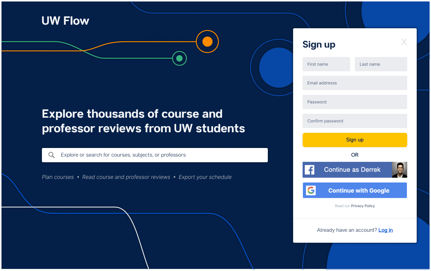

UW Flow is a popular platform for UW students to share course and professor reviews. It was created in 2012 by a group of Software Engineering students. While the site remained a useful resource for students, it began to suffer over time from lack of maintenance. In 2019, a team of students and I decided to revamp UW Flow.
I was the designer for UW Flow 2.0 — my goal was to design a platform that would best cater to our current users. I worked in a team of 2 backend developers, 2 frontend developers, and a product manager.
To assess how our users were interacting with UW Flow and what they value in the platform, the project began with gathering user research.
We sent out an online survey and interviewed 15 students from various majors and backgrounds who had used UW Flow. The participants were our user base: students at UW who use the platform.
There were some specific, actionable requests:
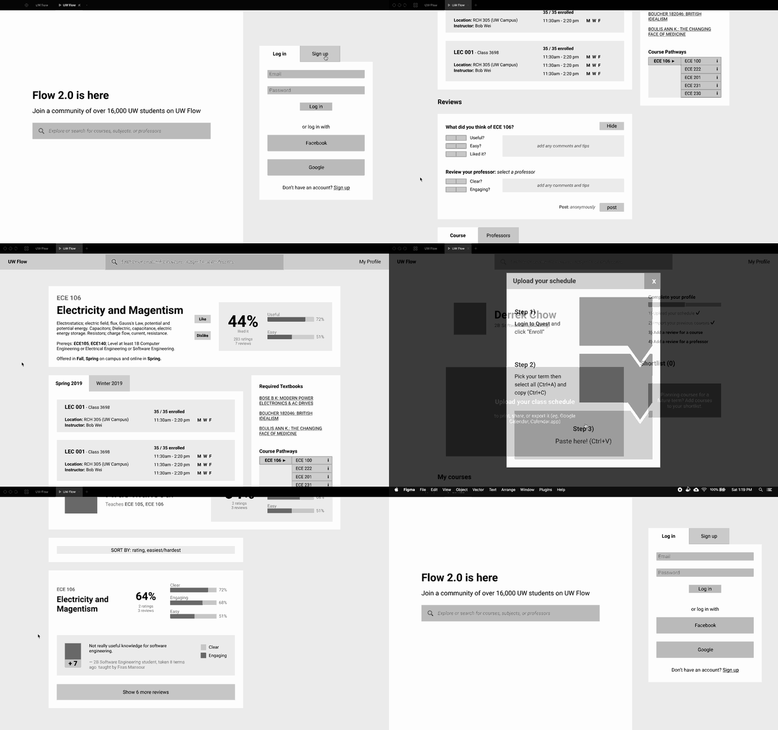
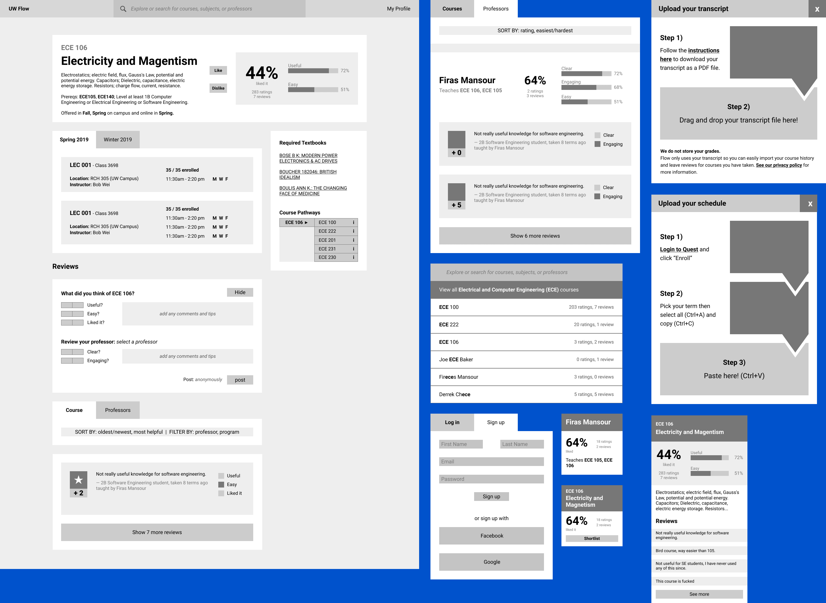
The wireframes are used to show the relationships between reviews of courses and professors as well as indicating the context of a review.
The wireframes connect to form a functional prototype that we could use as a reference when planning our backend architecture and defining our data models.
The focus for presenting UW Flow was a clear and simple design that would allow the content (course and professor reviews) to take center stage. Below are some guidelines created to define the UW Flow design: colors, typography, a style guide, components, and illustrations. I used Atlassian Colors and Feather Icons in the design. These guidelines were later be used to create mockups.

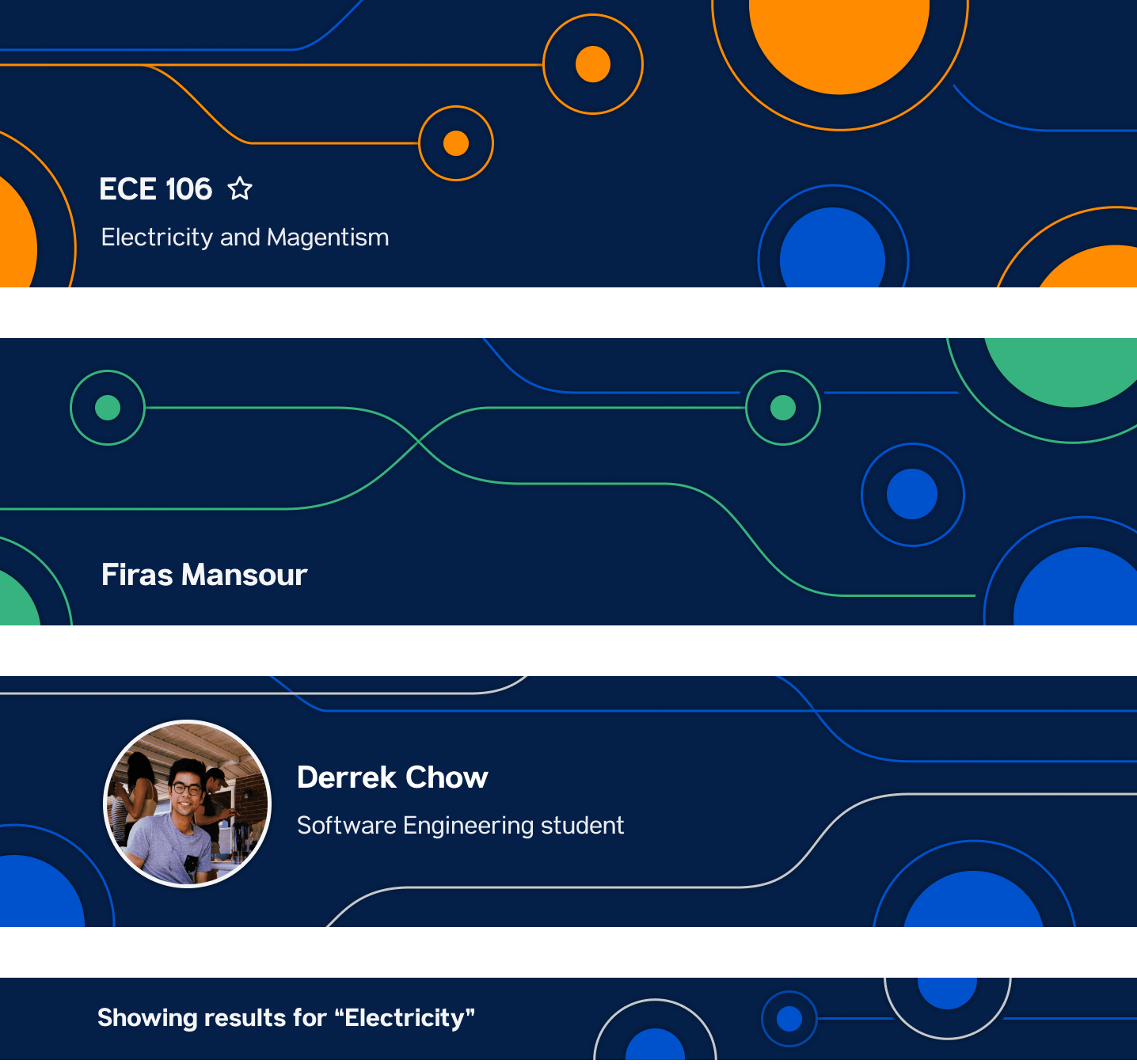
UW Flow is centered around reviews for 2 entities: courses and professors. Orange represents a course and green represents a professor — these symbolic colors are consistent across the design.
The illustrations found throughout the site represent a user's path to their ideal course through UW Flow. Their purpose was to further distinguish the different entities and pages of the site as well as create a distinct brand for UW Flow.
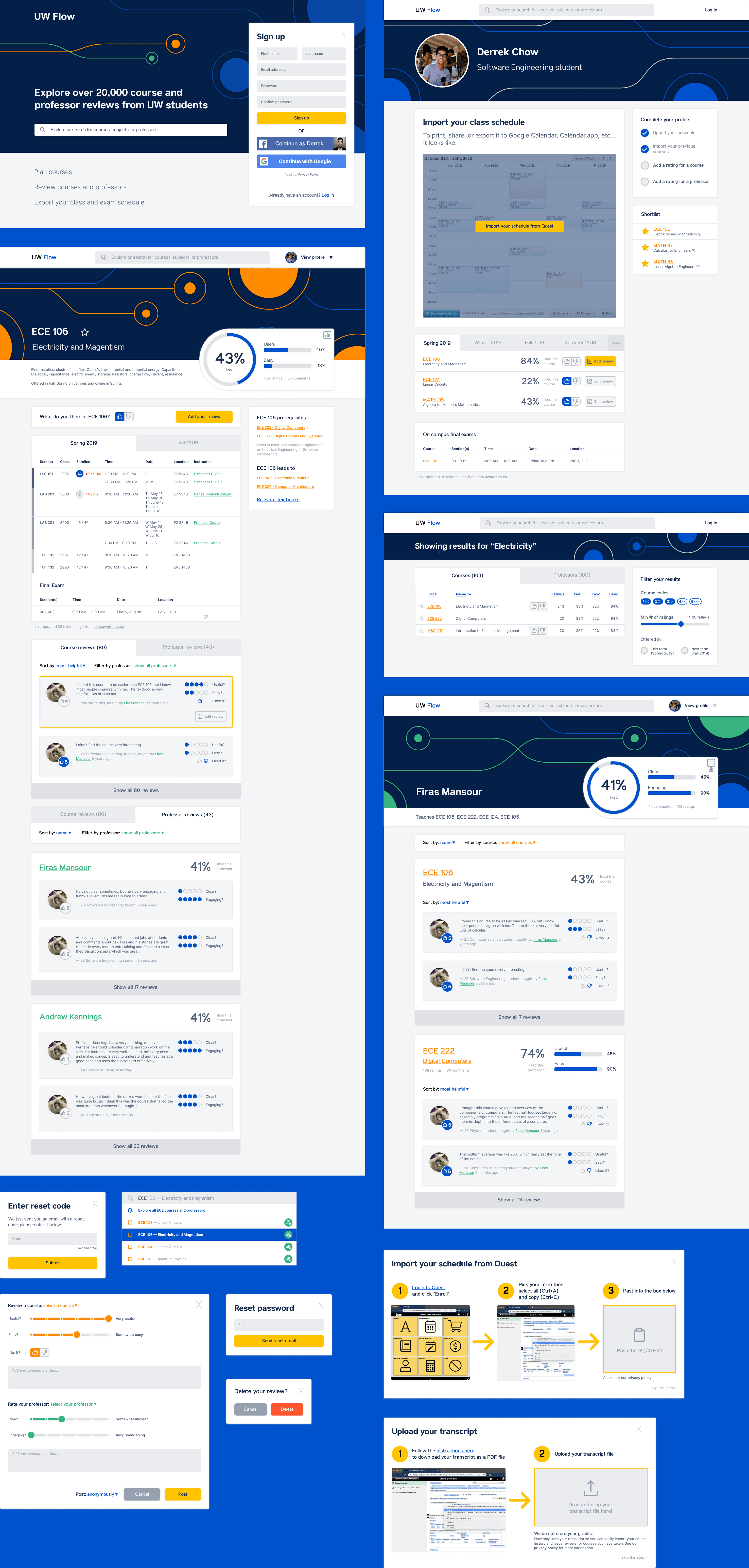
Below are mockups for the 7 pages of the platform: the Landing, Explore, Privacy, About, Course, Professor, and User pages as well as several miscellaneous components such as login modals, transcript and schedule upload, review modal, and search bar.
A design to highlight is the new explore page. Users can search the different courses/professors offered at UW through various filtering and sorting criteria. This was based on our user research of what students said they cared about when looking for a course/professor (eg: if a course is offered in their term or the year of the course).
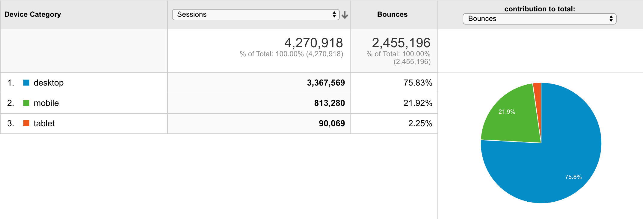
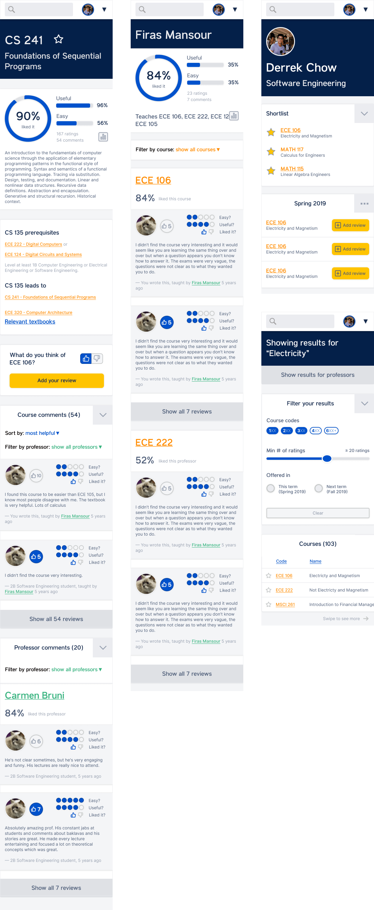
It was important the design supported mobile since 21.92% of our site sessions came from mobile devices. A responsive mobile design was chosen for consistency as well as development efficiency so the frontend team could reuse the components they built for desktop.
We began frontend development with React shortly after the creation of the mockups. React's paradigm lent itself well to the component-based design. User flows during our testing phase allowed us to catch any bugs or design flaws.
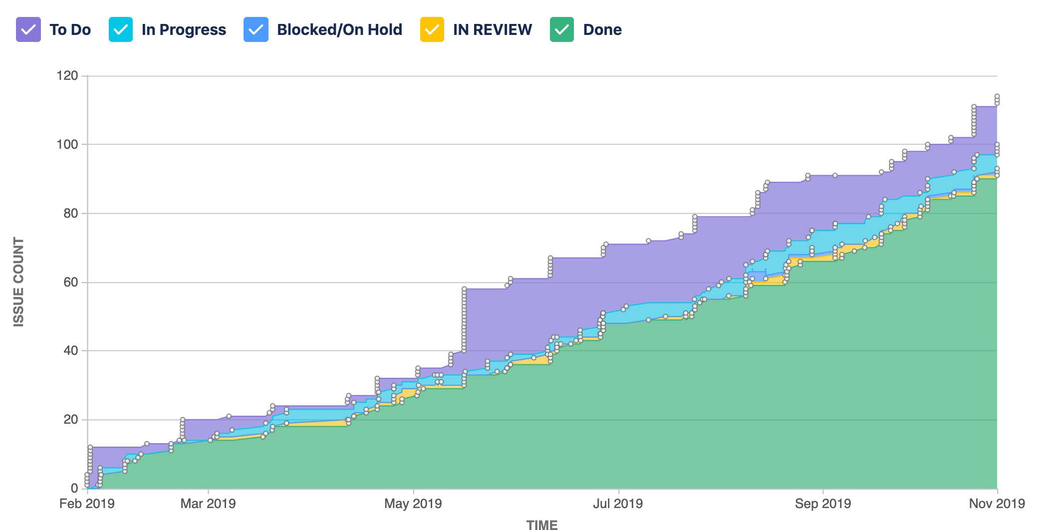
Below is a summary of 10 months of work comprised of 2-week sprints:
This project was very eye-opening for me in learning about the design and product development process. The 10 months of creating UW Flow 2.0 were not only deeply rewarding but also fun thanks to an incredibly talented group of teammates. Thank you: